Website for cleaning company
Miki nettoyage - 2023
Tools used
Figma
VS Code
WordPress
Illustrator
Duration
3 months
Role
Developer
Designer
For a recent project, I developed a showcase website for a small cleaning company in Lausanne. Collaborating with the owner, who had minimal online experience, I conducted a meeting to understand client's preferences. Despite initial uncertainty, we agreed to maintain the lilac color from already existing business card. I coded the website from scratch and later transitioned it to WordPress for easy client updates.
Post-appointment conclusion
1. Logo
The client didn't have a logo, so we decided to create one.
2. Business card
Redesign business card with new logo.
3. Website CMS
Create a CMS site to make it easier for client to update their information.
Logo creation
As the logo should be on the business card and on the website, I decided to start with the logo design, which would also give me an idea of what this company's visual identity could look like. I proposed two versions of the logo.
Using stars as a symbol of cleanliness is a powerful visual metaphor. Stars evoke notions of purity, quality, and excellence, aligning perfectly with the values associated with a cleaning company. This symbolism can create a positive impression and enhance customer confidence in the company's services.
Incorporating a broom or mop directly represents the cleaning activity, clearly communicating the company's nature. These elements add uniqueness to the logo and help define the industry to which the company belongs.
Choosing clean colors like blue can evoke freshness and cleanliness, while maintaining consistency in color reinforces brand recognition.
Bussines card redesign
For the business card design, I decided to make a double-sided card with the company logo on the front and information on the back.

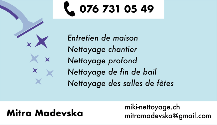
Placing the logo on the front of a business card ensures a strong initial visual impact, enhancing brand memorability.
Using the reverse side for information offers a clear separation between visuals and practical details, guiding the recipient's focus and ensuring easy access to essential information.
Creation of mood for website

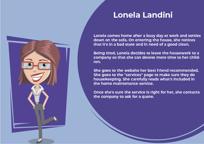
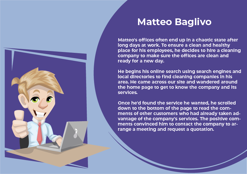
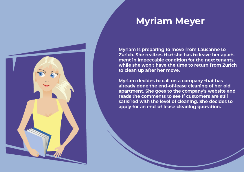
Target-user scenarios
Before creating the site, I defined user scenarios to help me better understand the needs, expectations and behaviors of your target users. This creates a solid foundation for designing a site that truly meets the requirements of your audience.
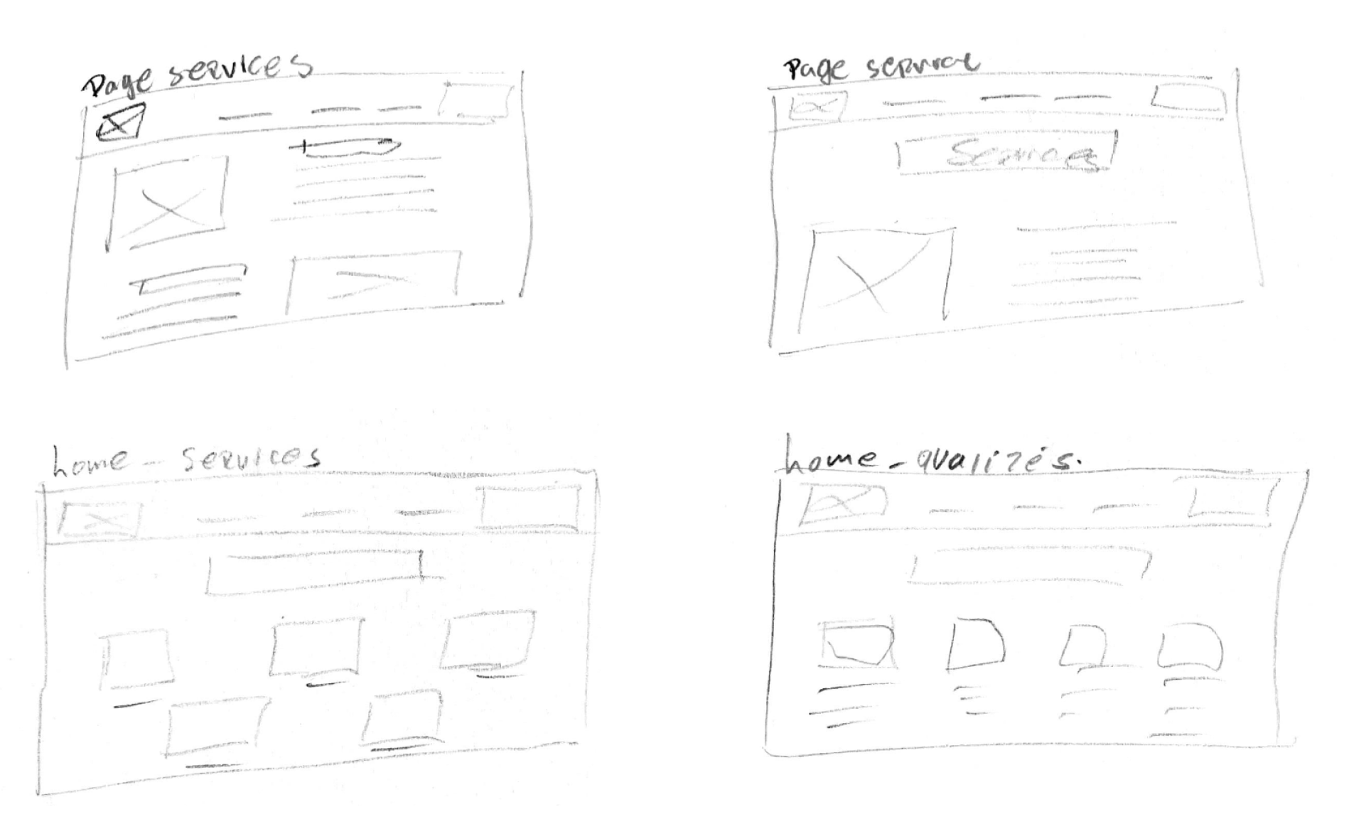
Sketchs - wireframe
I hand-crafted the first wireframes to give the customer an initial idea of what his site might look like. The client agreed to present the content I proposed. In other words:
Homepage
- Section: Who we are Who is Miki?
- Section: Why choose Miki? Qualities
- Section: Services
- Section: Contact us
Services page
Describe the services offered by the company
Contact page
Contact info and contact form
Figma model
Before coding the website, I created three versions of a prototype site mock-up to visually represent what site could look like. This allowed a client to review them and suggest any final adjustments. While the layouts were similar, variations in button colors and other elements were tested to find the most appealing design.
Below you can test the chosen model
Final result
As part of my interface development course, I coded the site from A to Z in Visual Studio Code. Whereas for my client's needs, I created the site in WordPress to make it easier to update the information. This enabled me to improve my skills with both tools.
miki-nettoyage.ch
This project enabled me to...
- improve my UI and UX design skills, by learning to create interactive mock-ups and prototypes.
- creating a showcase site from start to finish using a variety of tools can increase your professional versatility.
- learn how to solve problems encountered along the way
- learn how to manage a project from start to finish, respecting deadlines and collaborating with others.
- learn how to create personas to better understand target users and guide design decisions.