From desktop to mobile version
Trello app - 2023
Tools used
Figma
Duration
6 periods
Role
Designer
The aim of this project was to select an existing application and adapt its desktop interface to make it compatible with mobile devices.
After hearing about the Trello application, a task and project management platform, I decided to choose it as the subject of my project. Although I'd heard of the application, I'd never had the opportunity to try it out before.
This project was therefore an ideal opportunity to explore the desktop version of Trello, discover its features, and create a mobile version without first examining the existing interface.
Project steps
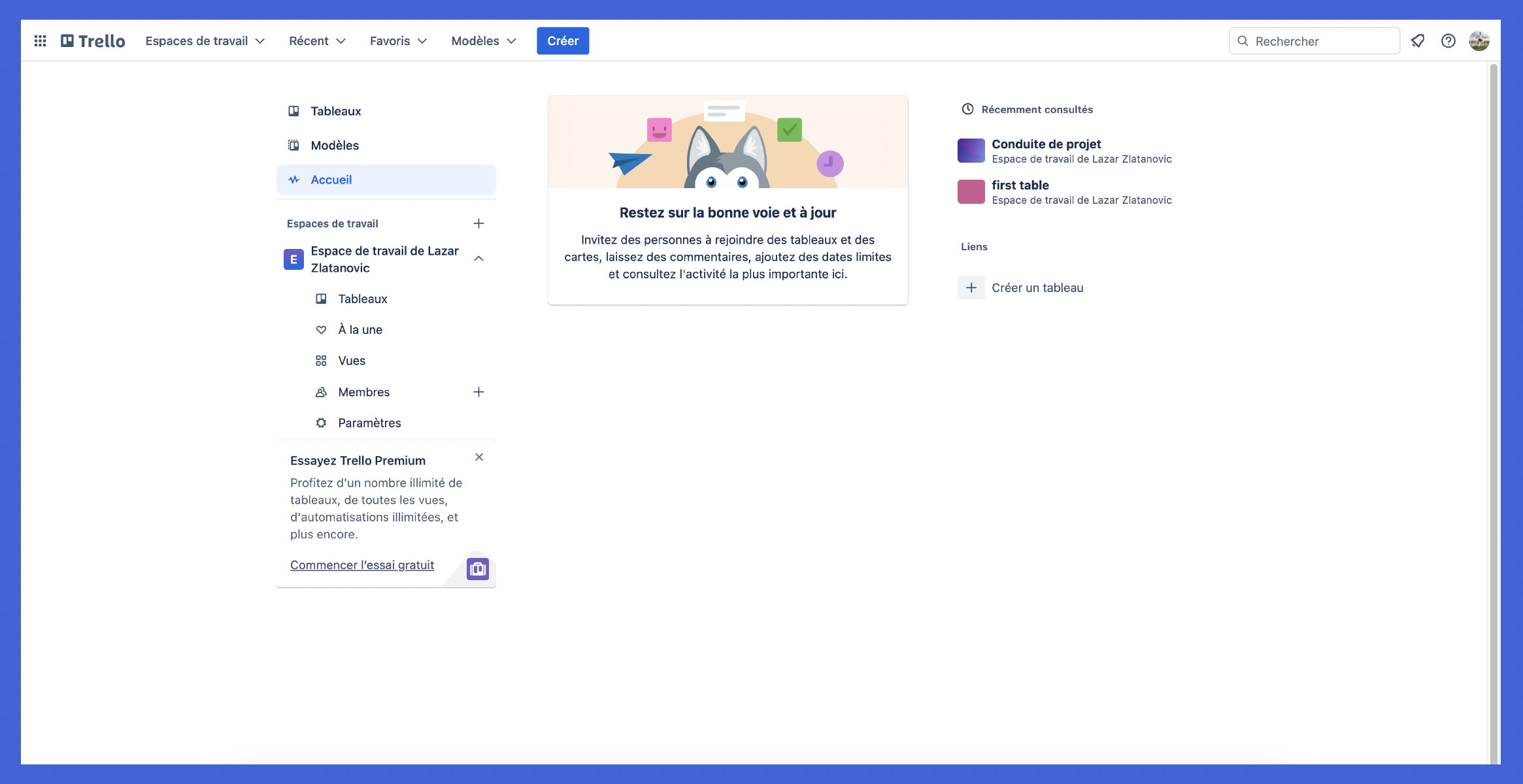
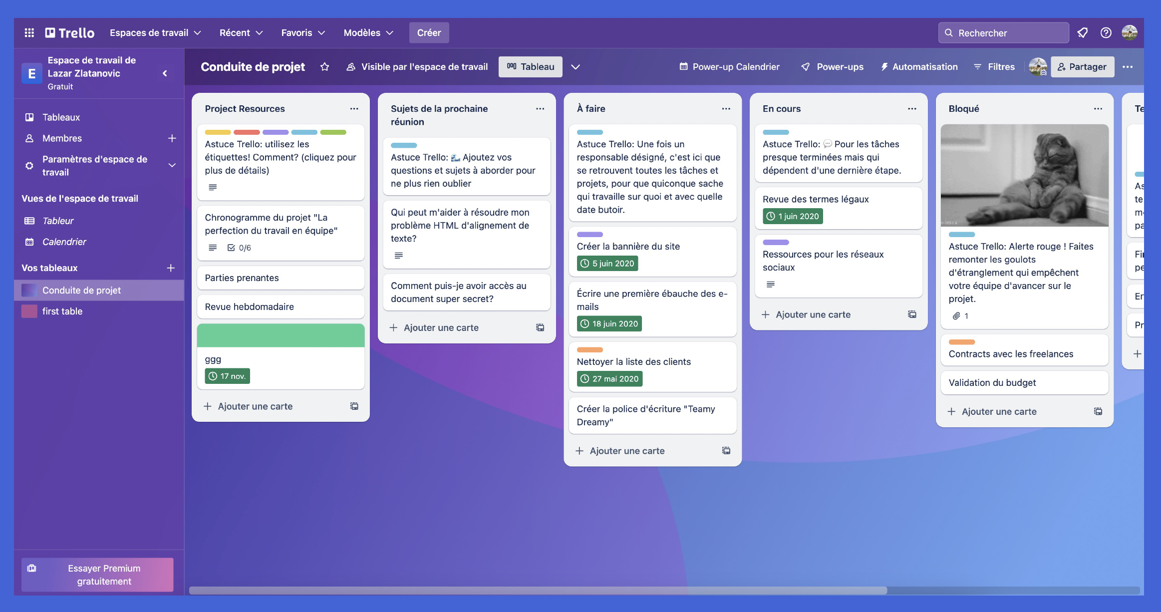
1. Desktop version analysis
Take screenshots of the desktop version and analyze the app
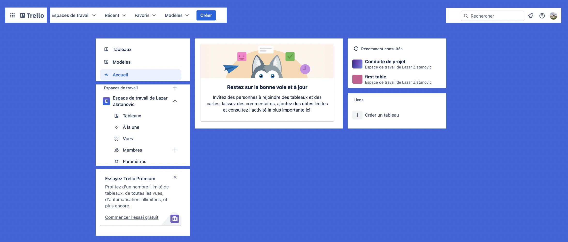
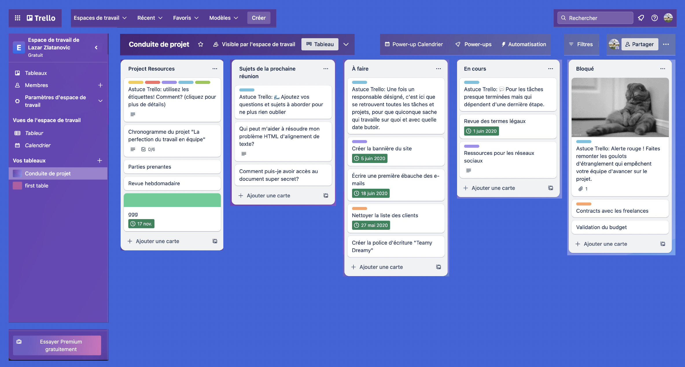
2. Interface dissection
Isolate the different parts of the interface that will be used later
3. Create a mobile version
Once the elements have been isolated, create a mobile interface
Analysis and dissection
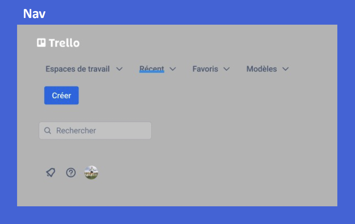
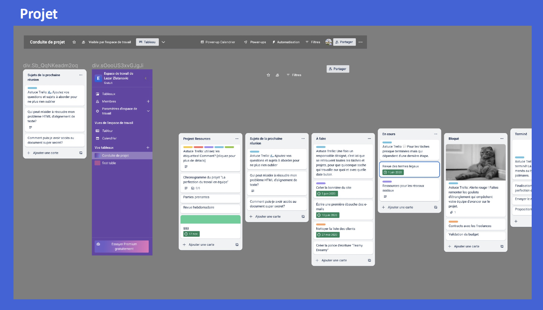
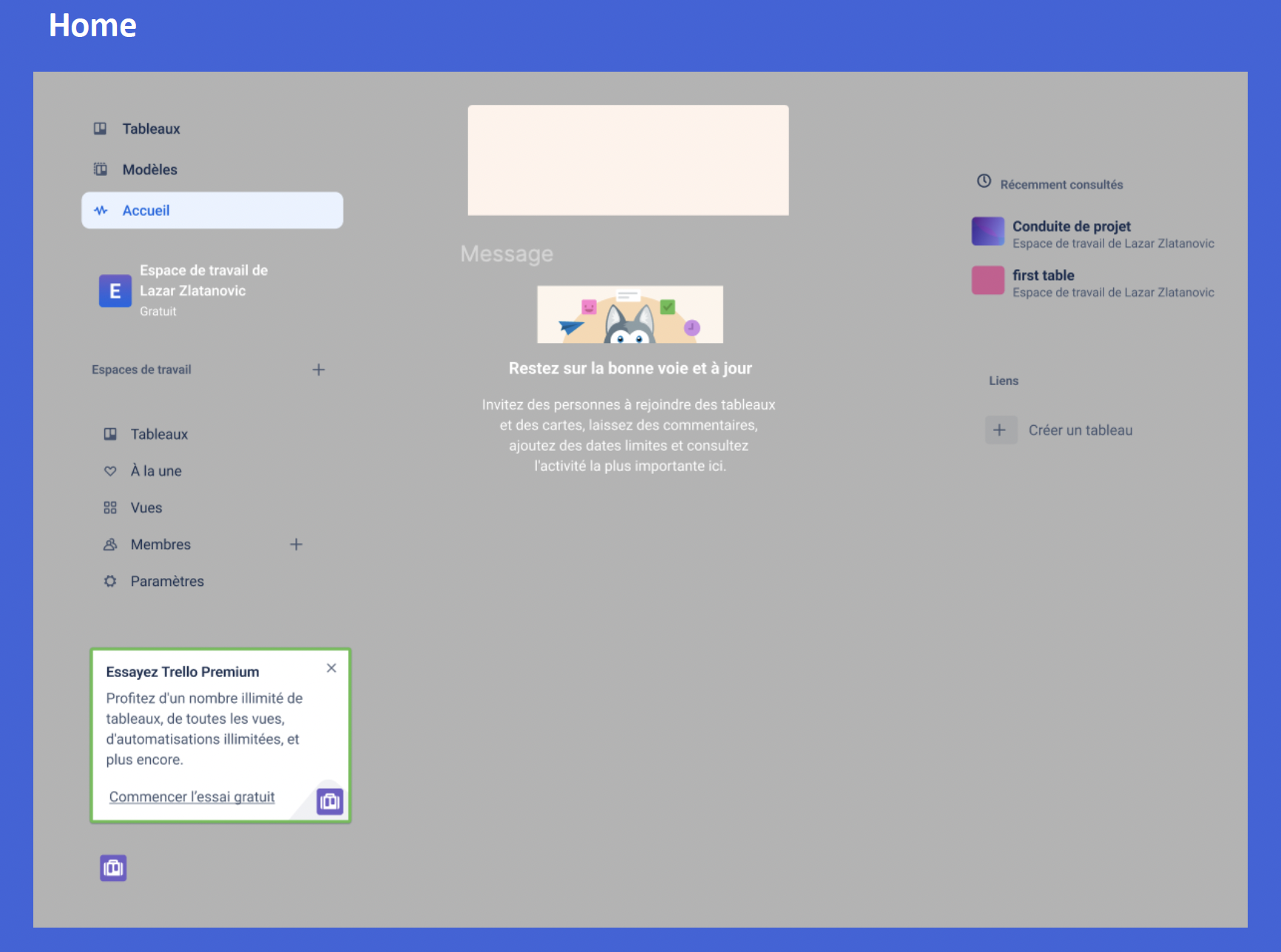
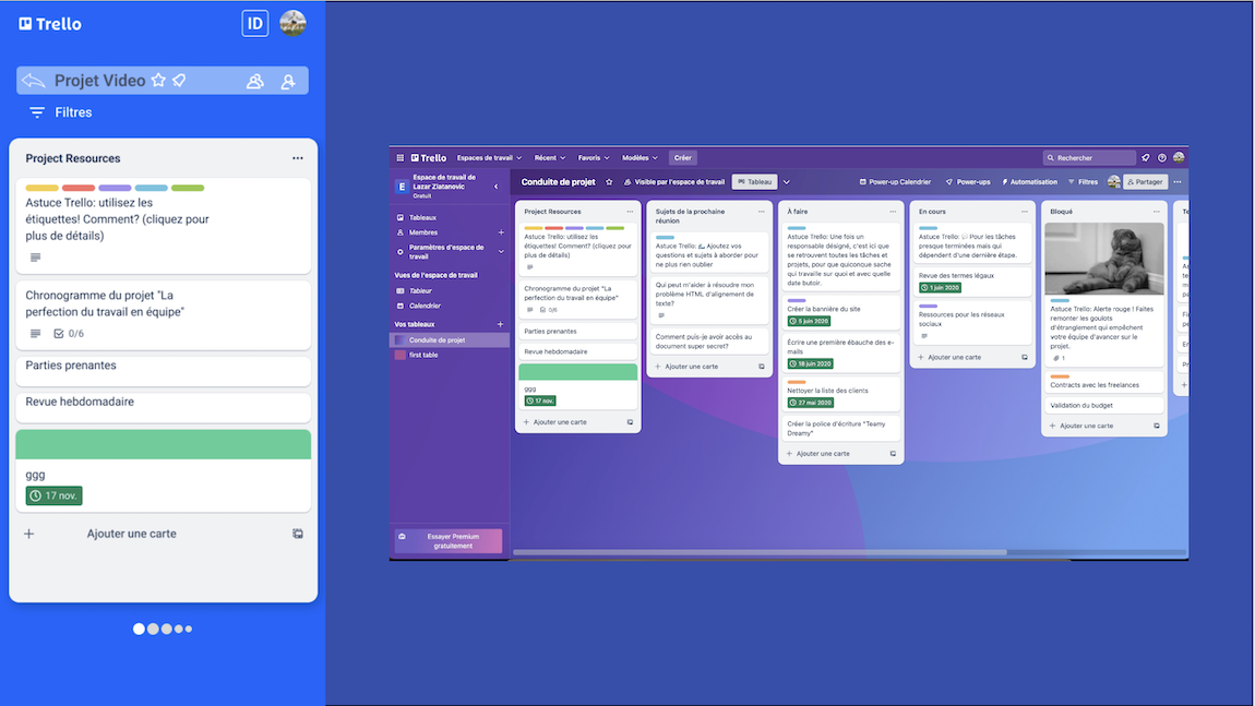
The analysis of the desktop version of the Trello application, carried out through screenshots, played a crucial role in the design process for the mobile version. These screenshots served as a starting point, allowing me to explore in detail the layout, functionality and aesthetics of the existing interface. They gave me an in-depth understanding of Trello's structure on large screens, highlighting the layout of tables, cards, lists and related functionality.
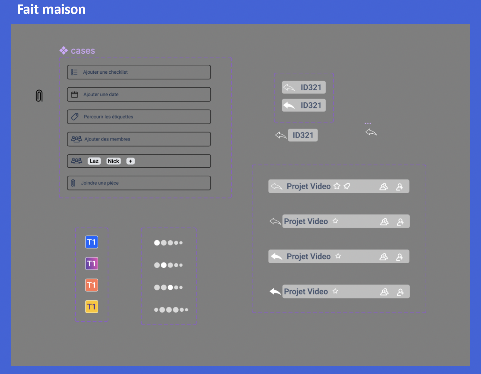
Dissecting each component of the interface gave me a detailed understanding of the different functionalities and their placement on the screen. This was particularly useful in identifying key elements and determining their importance in the mobile version.
For this part of the project, I chose to use the html to Figma plugin, which was a great help in reusing elements rather than recreating them. I then created a mini design kit from the isolated components I used to design the mobile version. However, I had to recreate a few elements that the plugin failed to recognize.
Design of mobile version
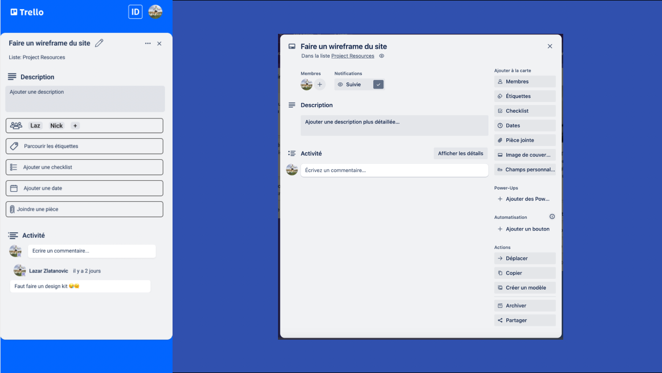
During the design process for the mobile interface, I took the decision to eliminate certain elements that I considered non-essential for an optimal user experience on mobile devices. These included buttons and plugin functionality that, while relevant on the desktop version, might be deemed superfluous or less suited to the limited space of mobile screens.

Chellenges
One of the main challenges was to manage the limited space on mobile screens while providing a complete and intuitive overview of project organization information.
Striking the right balance between providing the necessary functionality and keeping the interface simple was a challenge. Information overload had to be avoided, while providing quick access to essential elements.
Figma model
Conclusion
The intention was to create an original mobile adaptation based on my own ideas and interpretations of the application, without being influenced by its existing version. This approach enabled me to make an interesting comparison between the two versions once the project was completed, highlighting the design choices made and any improvements made to the user experience.
This project enabled me to...
- Learn how to prioritize and reorganize interface elements for an optimal mobile user experience.
- Identify crucial information to be displayed on a smaller mobile screen.
- Learn how to reduce content while preserving clarity and relevance.
- Strengthen ability to explain design choices in terms of mobile user experience.